Graphic Design Ad Campaign
School safety has been one of the most controversial issues of our time, especially considering all the recent events that have occurred across the country. School safety is an important issue that needs to be addressed. Art teacher Michael Kunz and his graphic design students attempted to bring awareness to LHS by creating ad campaigns on issues. Located on the steps near the cafeteria, library, and nurse’s office.
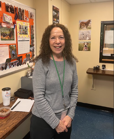
 Mike Kunz
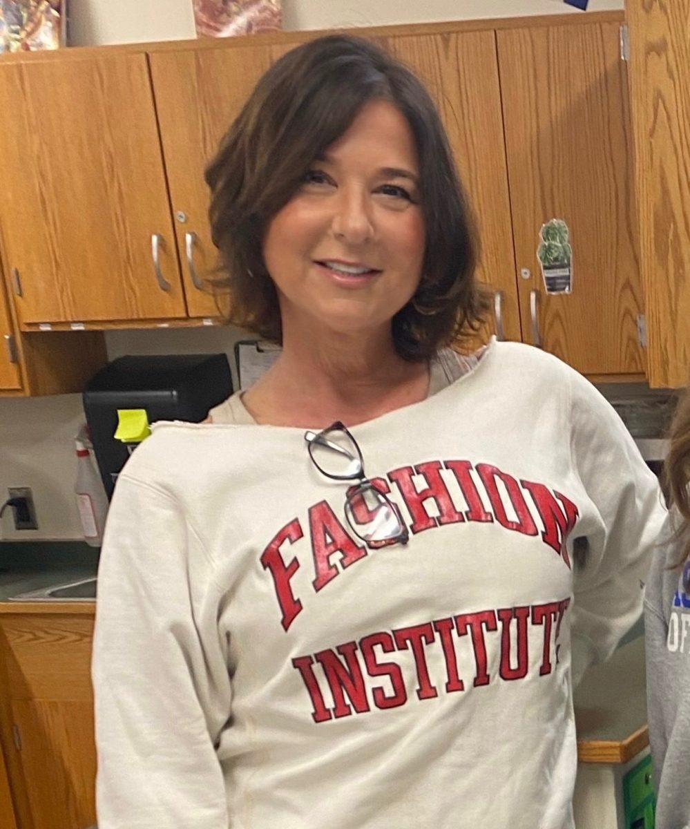
Kunz’s graphic design class embark on various real-life class projects that emanate reality, such as creating a holiday-themed Starbucks cup and creating a t-shirt logo design for a company. However, Kunz decided to bring back another project that is relevant to today. His second period graphic design class was split into six teams, each with three people. Their goal was to create an ad campaign based on school safety, and each group needed a unifying factor to bring its ad campaign together. In previous years, different topics and themes were explored. “We do this project every couple years, and I try to pick a theme that is current and relevant,” Kunz stated. “In years past, we have done ad campaigns for donating blood, Relay for Life, and anti-bullying.”
Students had to exhibit certain requirements in the project, which include font pairing, an Ad Council logo, and a sponsor for the ad campaign, just to name a few. There were ad campaigns about fire safety, lockdown procedures, and student entrance/exit points. However, Principal Rainis decided to choose one of these ad campaigns to display to the students and faculty, and that was the “Be” ad campaign (every design starts with “Be”) that was created by senior Stephanie Syrota, senior Paul Traumiller, and junior Joshua Polansky.
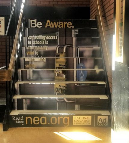
Syrota’s design was entitled “Be Aware.” It focused on the use of all doors going in and out of LHS. Ever since the shooting at Marjory Stoneman Douglas on February 14, LHS has implemented new security measures to make sure the school environment is safe and secure. This design depicts school doors with caution tape around the door handles. This is due to the new security measure set in place that all students and faculty must enter and exit from the front door. Its design is subtle, but the message is clear. Syrota had this to say about her design: “I want people to look at my design and appreciate the artistry of it but also to be more aware of their actions when trying to leave through the library doors. The ad campaign has made me think more about my actions when I try to leave the school. I think that we should try to imagine if something bad happens because nobody expects the bad things to happen to them, so we should be proactive to make sure nothing does happen.” Her design can be seen on the steps near the library.
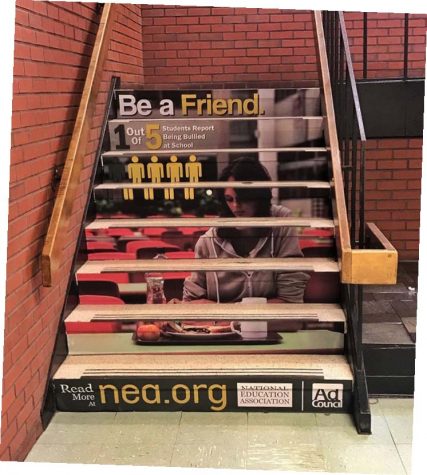 Paul Traumiller’s design was “Be a Friend.” His design aimed at prompting students to attempt to be friendly with everyone, no matter who the person is or what the situation is. The design depicts a girl sitting alone and eating her food at a lunch table. Traumiller included a statistic that one out of five students report being bullied at school. This is an alarming statistic; however, it is one that the students can help to eliminate. Traumiller hopes that his design will lead the charge and make LHS a friendlier place: “I hope that my design will teach kids to be nice and friendly to each other. Too many kids are bullied inside school doors, and it should be a sanctuary for learning and not a place to be feared.” His design can be seen on the steps near the cafeteria, fitting as if any student sees someone eating lunch alone and decides to act upon it.
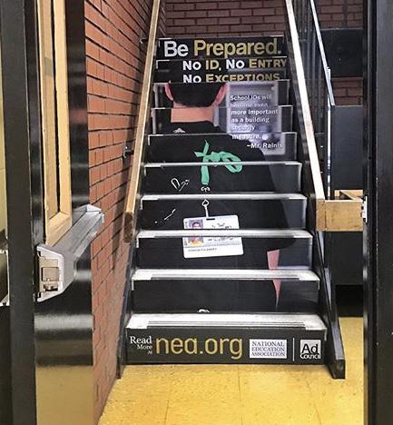
My design was called “Be Aware.” It corresponds with the new policy that every student must have his/her ID with him/her when they enter the building, and if not, he/she will not be allowed in the building. Due to this, Syrota took a picture of me near the front doors of the school with my ID hanging off of my backpack, and I came up with the slogan “No ID, No Entry, No Exceptions.” I coupled this picture and slogan with a quotation from Rainis that reads, “School IDs will become even more important as a building security measure.” School IDs have become a necessity to the school, so it is imperative that students have them in their possession when coming to school. This design can be seen on the steps near the nurse’s office.
These three designs incorporate the message of safety that Principal Joe Rainis has been stating. He took it upon himself to assure the students and faculty that if we work together to create a stable, safe, and friendly school environment, LHS will be a safer environment. “I said it after the events of Marjory Stoneman Douglas. ‘Protect the house.’ Students and staff safety is everyone’s business. Protect one another, and protect yourselves, stated Rainis.”


